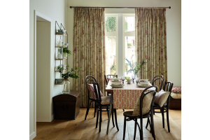
Shape up your space with geometrics
Geometrics first made their mark during the 1960s mod years, but they’re back in a big way and bringing a punch of personality to home décor. Here’s how to use bold graphic shapes to take your room from bland to breath-taking.
Geometry 101
Few people would cite maths as their favourite lesson in school but, when it comes to decorating, there are benefits to understanding the science of shapes. Not all geometrics are created equal, and lots of interior designers will tell you that some are easier to use in your décor than others. If you’re new to using graphic prints, start with popular patterns like hexagons, diamonds and stripes, then bring in other shapes as you grow in confidence.
Small touches go a long way
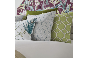
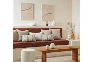
Geometrics make an attention-grabbing statement, so it’s a good idea to try them in small doses in the first instance. That way, you can have fun without making a big commitment. Add some vibrant, geometric cushions to a plain sofa, switch a simple lampshade for one with an edgy print, or invest in a showy, graphic rug. Geometric shapes are especially eye catching on walls, so display some geometric artwork or install shapely shelving like these from Etsy.
…But don’t be afraid to go big
At the same time, if you’ve fallen in love with a graphic print (and let’s face it, why wouldn’t you?) then there’s no reason why you can’t showcase it in a big way. Reupholster your sofa to instantly create a conversation piece or craft a maximum-impact feature wall. If you’re mixing lots of different fabrics together then the most important thing to consider is the way you pair patterns of different scales. A larger pattern will always overshadow the smaller one so couple shapes with the next largest or smallest patterns.
Stay soft and grounded
Because of their straight, clean lines, there’s a danger that geometrics can become too harsh-looking. Combat this by offsetting structured patterns with those which have curves or waves, such as the Ellipse fabric from iLiv. It’s also important to ‘ground’ your geometric patterns to keep your room from feeling too busy. Do this by creating a few spots of block colour within your scheme to give the eyes a place to rest.
Colour is critical
Your colour scheme is key when decorating with geometrics. Choose too many shades and your room will look gaudy; too few and the patterns will lose their impact. The best advice is to select a colour family which connects all of the patterns being used in the room. Use similar colours or different shades from the same family so that your colours complement rather than compete with one another, while still providing enough contrast to add depth.
What do you think of the geometrics trend? Tell us in the comments below.


