Pantone’s colour trend predictions 2018
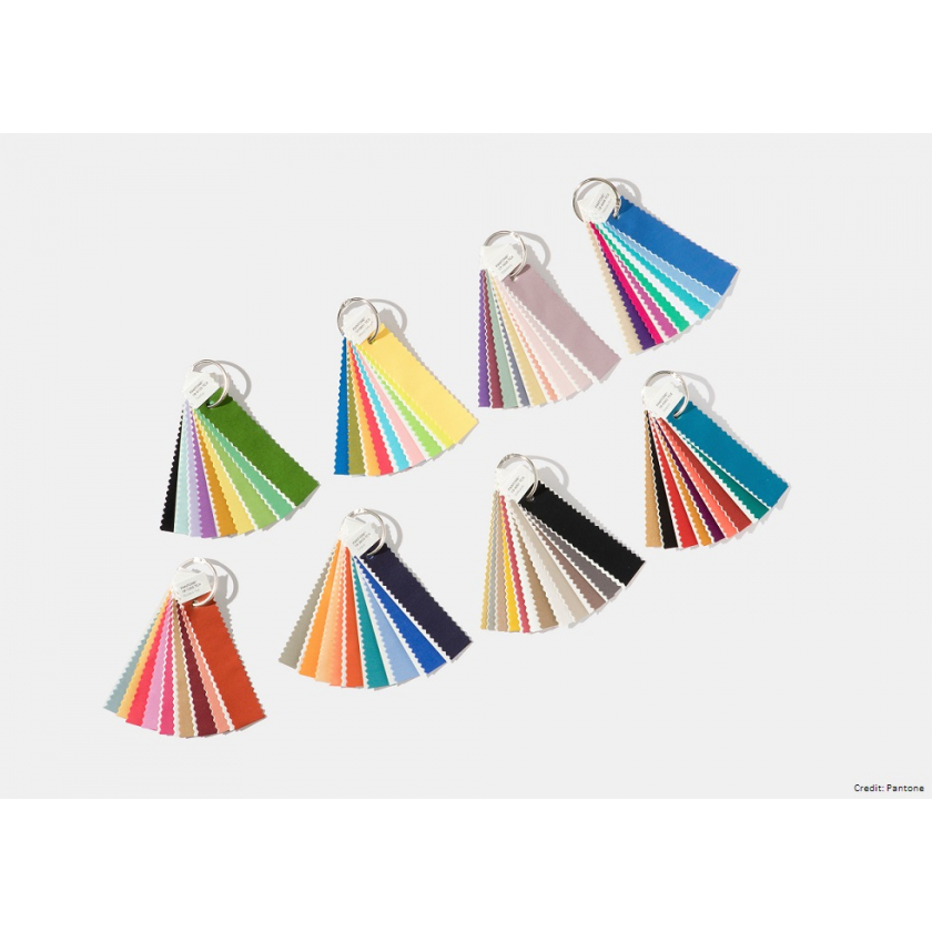
The Pantone colour forecast for 2018 has arrived, and the paint prophet is predicting a move away from pastel shades into bolder, brighter hues. Here’s a closer look at each of the eight palettes we can expect to see next year and how you could use them. Ready, set, scheme!
Verdure
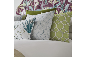
Pantone calls this palette ‘symbolic of health’, and there’s certainly a vegetal theme with paints including Berry Purple and Celery Green. The softer hues mean you could cover an entire wall without things feeling too ‘in your face’ (think clean lines and colour blocking), or for a more subtle take, pops of colour would complement a monochromatic grey and white palette. The natural shades are perfect for a coastal theme, too.
Playful
As its name suggests, the Playful palette is fun and whimsical, featuring bright and bold colours such as Minion Yellow, Lime Popsicle and Blue Skydiver. It’s not a palette to be taken too seriously and looks great with geometric prints. Introduce bursts of colour with abstract cushions or throws to transform a room from bland to beautiful.
Discretion
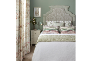
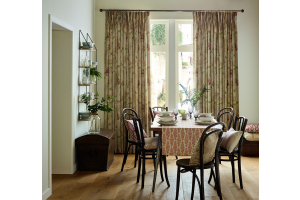
Branded as “Playful’s alter ego”, Discretion features subtle and nostalgic hues like Burnished Lilac, Hawthorne Rose, and Elderberry. These shades are perfect in floral prints and can be used to create a delicate and refined country house interior. The pinky colours are both girly and grown up, so we’d love to see them incorporated into a little girl’s room.
Far-fetched
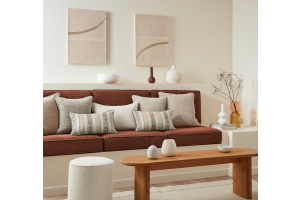
This palette “reaches out and embraces many different cultures”, according to Pantone. Earthy tones, like Cornsilk Yellow, are combined with rosy colours including Iced Coffee and Ruby Wine. To really make an impact, use it in fabrics which take their style cues from far-flung locations, such as the Samira collection by iLiv.
Resourceful
Two of our favourite colours on the spectrum – orange and blue – make up the Resourceful colour scheme. It gets its name because it’s the ‘clever’ palette, using complementary colours on the colour wheel and intended to be a way of re-using and refurbishing what consumers may already own. The combination of warm and cool tones draws the attention, so choose fabrics with quirky and eye-catching designs.
Intricacy
As you can probably guess, this palette reflects the popularity of intricate designs. It features metallics – dubbed the “new neutrals” – as well as florid shades including Holly Berry Red and Yellow Sulphur. It’s as though this palette was made to be used in a patterned wallpaper; we’d contrast an elaborate feature wall against some deep wooden furniture.
Intensity
The orange, black and gold shades in the Intensity palette, with names like Molten Lava, Emberglow and Bossa Nova, are as dramatic as they sound, while the blend of plum, blue and blue-green shades cool things back down. Using such strong shades in a big way is probably best left to the experts, but would make for beautiful appliqued throw cushions. They’d be a simple but effective way to invoke the sense of strength, power and sophistication the palette wants to be known for.
Tech-nique
Pantone’s nod to technology features hues it says “seem to shine from within” – think fuchsia, purple, turquoise and iridescent peacock tones, offset by Brilliant White and Frosted Almond. Given that this palette draws its inspiration from technology we think it’s only right to use it in a scheme with a modern, fresh look – think bold shapes and clean lines.
Which is your favourite palette? Tell us in the comments below.
