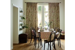
Avoiding common interior design mistakes
You don’t need to be a home décor expert to create beautiful interiors, but it’s helpful to understand a few basic design principles. Knowing right from wrong can make all the difference to your overall aesthetic and transform a room that looks cramped and chaotic into one that’s functional and fabulous. To give you a helping hand, here are a few of the most common mistakes in interior design and how to avoid them.
1. Forgetting to plan
It can be tempting to dive straight in when you start a new project, but proper planning is crucial. It’s natural to want to buy everything you fall in love with, but not all the items that take your fancy will work well together. We recommend selecting your furniture first; it’s much easier to match paint or wallpaper to furniture than it is the other way around. You’ll also need to have a clear budget in mind so you don’t blow everything on that statement sofa before you’ve bought your curtains.
2. Sizing sins
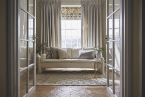
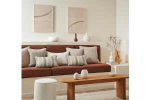
Furniture that’s too large will make a room look cramped, and furniture that’s too small will look unbalanced and awkward. Avoid grouping too many large pieces together, and don’t place all your furniture against the walls. If you’re hanging wall art, make sure it isn’t so large that it dwarfs the wall, and hang it at eye-level. Curtains should be hung as close to the ceiling as possible to create height.
3. Over-complicating
Keep it simple; you don’t want your room to look like a dumping ground for knick-knacks. If there’s too much going on it will look cluttered and distracting and can make a room appear smaller. Get creative with your storage to conceal those items you need, but don’t necessarily want to see. The “less is more” rule applies to your use of colour too, three or four different colours within a scheme is plenty.
4. The perfect match
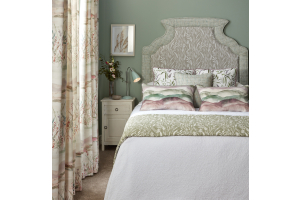
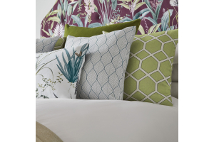
Be careful not to buy everything from the same shop or collection, or in exactly the same size or colour. A room filled with matching pieces can look boring and appear lacking in personality or dimension. Select textiles, finishes and furnishings which work well together but still reflect your own personal style. Mix up sizes and think of a cityscape when you’re arranging accessories. Remember, your décor should be coordinated, but that doesn’t mean everything has to match.
5. Poor lighting
Lighting is one of the most important elements of design but is often overlooked. Be careful not to block any natural light sources, and place mirrors opposite windows to bounce the flow of light around the room. You should also have more than one artificial light source; complement your overhead lighting with a lamp or two. The key is to get the right balance – you don’t want a room that’s so bright it looks clinical, but the right amount of light will enhance and flatter your interiors.


